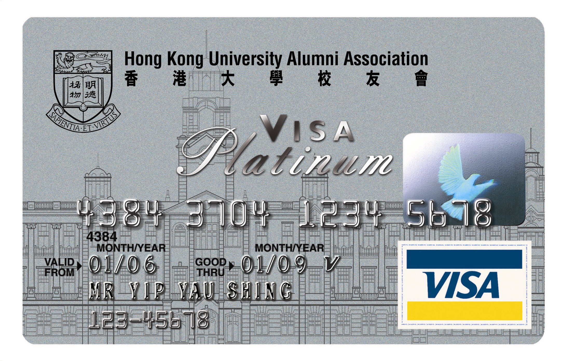
Thought id mix it up and specifically post some platinum credit cards. These are all great, let me know whats your favourite?
I think all these platinum credit card designs are quite appealign. They all look smooth and fresh for a credit card. The bank took a suttle approach with these credit cards and it works.
Welcome to my blog on credit card graphics. Like the title says i compare credit cards GRAPHICALLY! I dont give a damn about how much APR returns or percentages and figures. All i care about is how a credit card looks!
Ever since i was young i remember looking at credit cards or debit cards or any bank card for that matter and loving the graphics they put on them. Each one was unique to a person for such a long time, it almost formed part of their identity. As i got older and got cards for myself i developed attachements to my favourite credit card graphics. Here i look to share some of the most inspiring, artistic and beautiful bank card designs i have seen.
Im a huge fan of american express credit cards, platinum credit cards, gold credit cards, limitless credit cards. You know the deal. Any bank account that falls under those expensive credit card brackets you can expect to find info on here.
Follow me for unique and valuable credit card updates.
Im a huge fan of american express credit cards, platinum credit cards, gold credit cards, limitless credit cards. You know the deal. Any bank account that falls under those expensive credit card brackets you can expect to find info on here.
Follow me for unique and valuable credit card updates.
Thursday, 14 April 2011
Subscribe to:
Post Comments (Atom)


I was going to say I liked the Hongkong uni one, but then I started to not like it because it was a bit complicated. I like the ICICI one though.
ReplyDeleteI completely agree, when you're earning enough to get a platinum you want something classy, these cards fit the bill!
ReplyDeleteHong Kong Allumni? They have their own platinum card...?
ReplyDeleteI like the post!!!
ReplyDelete$upporting BRO!!
The middle one (Hong Kong....)is the best looking in my opinion.
ReplyDeletenah, i still like the Google one
ReplyDeleteThese are nice!
ReplyDeleteYes, nice design indeed.
ReplyDeleteNot as cool as the Game ones but I suppose they are still cool. :D
ReplyDeleteVery cool blog man love what your doing so far will def follow you and comment everyday. I was hoping you could do the same for me.
ReplyDeletePlatinum designs always gotta be clean and crisp. No teenages be bustin' black visa!
ReplyDeleteThe Hong Kong one looks the most regal.
ReplyDeleteThe last one has a nice plant pattern to it, always like those.
ReplyDeletenice design VISA C=
ReplyDeleteHONK KONG PLATINIUM (y)
ReplyDeleteI like the last one
ReplyDeletenice cards :P
ReplyDeleteI like very much these different themes of cards.
ReplyDeletei like the second one
ReplyDeletevery appealing designs
ReplyDeleteLast one is best i think but i would rather have a street fighter or Resident evil card
ReplyDeletefirst one looks like it should be a futuristic card
ReplyDeleteI like the middle one for some reason... not sure why.
ReplyDeleteThat's crazy cool!
ReplyDeleteYour right! The suttle approach the banks took really does work! I want one! Followed.
ReplyDeleteboth are great!
ReplyDeletethird one is the best
ReplyDeleteI like the ICICI one
ReplyDeleteThe one from hong kong is the best. Best design, and its from an exotic country:)
ReplyDeleteWow, I like this ones :)
ReplyDeleteHave you seen the Amex cards that are thick and heavy, and pics of those?
ReplyDeleteI like the Hong Kong one. :)
ReplyDeleteI like the middle one quite a bit. It seems quite prestigious.
ReplyDeletegreat post as always
ReplyDeleteI'm liking the second card, the architecture building is nice :D
ReplyDeleteThey're all decent, but I'm not a big fan of any of them
ReplyDeletethey are pretty
ReplyDeletesimple, yet i like them
ReplyDeleteSorry, I'm a sucker for Plumb.
ReplyDeletei like the first the best for sure
ReplyDeletei don't know if it was pointed out but 'subtle' is the correct spelling. my fav is the middle one it is very sleek.
ReplyDeleteThose look awesome.
ReplyDeleteAs everyone else, I liked the one form Hong Kong.
ReplyDeleteHuh, I really like the last one, but I'm not too sure about the other two.
ReplyDelete