Found a couple of credit cards whose theme is the planet earth. Pretty cool so i thought id let you check them out.
This card shows a comet circling our planet. Pretty cool; this credit card shows your about the world and you got the money to prove it!
This credit card shows it from the view of the moon. A really cool concept for a credit card. I apologise for the low res. credit card.
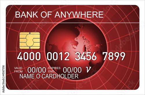
This credit card mixes up the theme a little bit with the red. A nice look with the globe central this credit card is certainly one of importance.
This is my favourite. Simple, this credit card doesnt mess around with fancy designs, it shows what the credit card is trying to display and leaves it at that.
The reverse also marks itself with a smaller globe. A cool credit card no doubt.
Ill be back tomorrow with another theme, thanks everyone!
Welcome to my blog on credit card graphics. Like the title says i compare credit cards GRAPHICALLY! I dont give a damn about how much APR returns or percentages and figures. All i care about is how a credit card looks!
Ever since i was young i remember looking at credit cards or debit cards or any bank card for that matter and loving the graphics they put on them. Each one was unique to a person for such a long time, it almost formed part of their identity. As i got older and got cards for myself i developed attachements to my favourite credit card graphics. Here i look to share some of the most inspiring, artistic and beautiful bank card designs i have seen.
Im a huge fan of american express credit cards, platinum credit cards, gold credit cards, limitless credit cards. You know the deal. Any bank account that falls under those expensive credit card brackets you can expect to find info on here.
Follow me for unique and valuable credit card updates.
Im a huge fan of american express credit cards, platinum credit cards, gold credit cards, limitless credit cards. You know the deal. Any bank account that falls under those expensive credit card brackets you can expect to find info on here.
Follow me for unique and valuable credit card updates.


The first one looks super awesome. I like it a lot.
ReplyDeleteI love the first and last ones the most. Good post!
ReplyDeleteI like the last two :)
ReplyDeleteThat first one is the best.
ReplyDeleteI love the meteor hitting the earth one! lol.
ReplyDeleteaahaha that first apocolypse style one is pretty funny
ReplyDeletehave to agree with you on that one, the last one is definitely the best
ReplyDeleteThat's actually really awesome. I need to get myself a card with a custom background!
ReplyDeleteMy favorite is your favorite. It's niiice
ReplyDeleteThe last one's my favorite too. Keep it simple is a great advice for anything.
ReplyDeleteI love the comet one! Very foreboding!
ReplyDeleteI like the simple grey scale globe one. that one is nice. except it would get all scracted up in my wallet... i should take better care of my things.
ReplyDeleteLiking the mother earth cards!
ReplyDeletethe first one is really cool
ReplyDeleteshould have been mom themed!
ReplyDeletelast one is really nice. weird seeing it w/out digits or names
ReplyDeleteThat red one looks cool!
ReplyDeletebtw, You've won an award from me! click the link for details:
http://ggc151.blogspot.com/2011/05/sunshine-award.html
because the earth is round, it turns me on
ReplyDeletewhat a great post, out of this world ;)
I'd like to have a 'checkmark' world card, showing where I've been. If there was a way to keep that updated, it'd be pretty awesome.
ReplyDeleteThese are cool!
ReplyDeleteTrypophobia. Second one. Do not want.
ReplyDeleteThird one, do want.
i like the last one!
ReplyDeleteI too dig that last design :D
ReplyDeletei like the first one the best, looks pretty badass :P
ReplyDeleteThey look great man! Very earthy
ReplyDeleteReally like the bottom one